Important Update: Transition from List View to Table View 🔍
固定された投稿
Hi everyone!
We have an important update for you regarding a change happening soon: the transition from List View to Table View.
Why the Transition?
As you may recall, the (New) Table View was designed with the objective of combining the features of both List and Table views, offering a comprehensive way to track and manage your work within Wrike. The move to a singular view aims to deliver a more unified and intuitive user experience, simplifying tasks and enhancing workflow efficiency.
The List View was built on older technologies we can no longer support. Sunsetting this view will help improve product performance and future improvements to the Table view.
Enhancements Based on Your Feedback
We greatly appreciate the feedback you’ve shared, and our team has implemented several updates to facilitate this transition:
- Public Links: Easy sharing and collaboration
- Mass-Enabling Project Progress
- Undo Button: Quick recovery from mistakes
- “Select All” in Mass Actions: Simplifies bulk changes
- Wrap Text: Improves readability
- Remembered Collapsed/Expanded State: Customizes your view settings
- Mass Actions: Switch assignees & shift dates easily
- Better visibility into custom fields with rich formatting options
- Grouping by any system or custom field
- Interactive Files column: allows to work with files right from the view: preview, download/upload, proof.
We’ve also made the Table View more user-friendly by supporting a compact, less cluttered display. You can now select between compact or default density, enable or disable any fields represented as columns, and choose between viewing tasks and subtasks hierarchically or in a plain list format.
Additionally, mass editing capabilities for projects and folders - previously unavailable in the old List View - have been added to enhance your workflow.
Transition Timeline
We aim to complete this transition by the end of March 2025, providing you with ample time to adjust to using the Table View exclusively. During this transition period, we encourage you to explore its functionalities and share any feedback you may have.
At the time of the transition, all existing List views will be migrated to Table views that will be configured in the same way as List to show the same information, in the same order, and keeping all the view settings like filters and sorting.
[Update from June, 2025 📌] Full sunset of list view will be completed in early Q3. Account owners will be receiving emails with the individual dates.
Please find more info about our team's plans for Table view enhancements as well as other useful info in this post.
We're Here to Help
Our team is here to assist and address any questions or concerns you might have during this transition. Our Product team is also working on more enhancements aimed at improving your experience with Table view even further.
We truly appreciate your understanding and support as we work to enhance the platform for everyone.
Lisa Community Team at Wrike Wrike Product Manager Wrike DiscoverでWrikeの専門家になりましょう
Lisa Wrike Team member Wrike DiscoverでWrikeの専門家になりましょう
Conrad Aleshire
You have to select the item by clicking on the checkbox in the first column. Then you can use the "Element-type" button in the top of the table view.
I also don't understand why this option is not available in the context menu, especially as mass editing is limited to changes within the same type (task oder project).
Hi Jessie Stith,
the default order of items in list view has always been by Priority.
If you like to use a different setting in your new table views, you could use the copy views functionality: https://help.wrike.com/hc/en-us/articles/360056639873-Wrike-Views#UUID-55251374-98ed-9320-b567-df954e9dc92c_custom_views:~:text=the%20UNDO%20option.-,Copy%20views%20to%20other%20locations,-You%20can%20copy
Florian
@Florian Kislich, Thanks for that, I found it using a more difficult way. Your way was shorter, thank you again.
We're long-time Wrike subscribers and we used to love it. It's integrated deeply into just about every aspect of our business. But...
I'm logging my disappointment and frustration that List View is being discontinued. This feature is a core part of our workflow, and its removal feels like a step backward rather than an improvement to the client experience.
In our experience, Wrike has a history of rolling out new features and changes to UI while sunsetting established, reliable ones—all in the name of "improvement." Yet, too often, these changes disrupt rather than improve our efficiency. This latest decision has led our team to seriously question whether Wrike is helping us perform better or simply optimizing for its own internal priorities. It feels like a move driven by developer and CTO needs rather than a customer-centric approach—streamlining for Wrike’s benefit at the cost of user experience.
With our renewal coming up in April, this forces a conversation about whether Wrike remains the right fit for us. Introduce enough friction, and at some point, we’ll be compelled to explore alternatives.
When the List view is removed, will you also be removing Table (old) view? I find that annoying that the old table view is still there.
I’ve been really frustrated with the latest update. It’s forcing us into using a view that severely limits our ability to manage tasks efficiently. The new table configuration doesn’t allow us to adequately display multiple folder names—even when trying to adjust column sizes, the issue persists. While features like tooltips or detail panels offer a temporary glimpse of the full information, they slow us down so much and don’t truly solve the problem.
The overall loss of flexibility in how we see our data is a major setback. We’ve invested significant time integrating our workflows with the system, based on list view, and now it feels like basic functionality we depended on is being stripped away for no good reason. What’s wrong with keeping the list mode available for those who do use it? This change is having a severely negative impact on our entire team, please reconsider removing list view!
Hi everyone!
Thank you for your continued feedback on the planned sunset of the List view. We understand the challenges this may pose, which is why we've decided to extend the gradual sunset to June 30, 2025. This extension provides you with more time to adjust, and we encourage you to explore the functionalities of the Table view.
We're committed to addressing your feedback, and we're thrilled to announce powerful new filters in Wrike Labs specifically for the Table view. Check out more info in this Community post.
Huge thanks again for your feedback, and let us know if there's anything else we can help you with.
Lisa Community Team at Wrike Wrike Product Manager Wrike DiscoverでWrikeの専門家になりましょう
Lisa Wrike Team member Wrike DiscoverでWrikeの専門家になりましょう
Lisa: My question is if you abbendon list view shouldnt "my todo", "created by me" and 'shared with me' also be in table view or at least the option to choose the prefered view? Now they are list view exept 'shared with me' that has multiple views like board, gantt but NOT table view. Blueprints starts also starts in list view, the folders in blueprints can be table view. Seems to me it is inconsistent policy to abbonden list view while a part of Wrike still not available on table view.
Also can it be made that there is a filter in 'shared with me' on location. If a tasks was removed from a location it is only in the shared with me we cannot find it easly. It is also not a filter option on dashboards
I agree with everyone's comments on all these multiple threads regarding the sunset of List View.
It dramatically changes the core and ease of use of Wrike for so many people.
I do use table view in lots of situations, but from a day to day project managing List view is the go to.
Some of my major annoyances for table view are:
Please listen to the valuable feedback from your users.
Pablo Slobodiuk I whole-heartedly agree. This transition has been billed as "combining the features of both List and Table views" with a fair number of glaringly obvious points that don't meet that description. Wrike is also toting this as aiming "to deliver a more unified and intuitive user experience, simplifying tasks and enhancing workflow efficiency" however I would argue it is less intuitive and less simplified (case in point the fact that when rescheduling a Task in Table view requires entering a Start and Due Date, whereas in List view you could simply update the Due Date, and the Task Duration would dictate the updated Start Date).I am glad you have listed out most of the issues users are facing with the removed functionality and simplicity (not to mention the much less-intuitive, less-clean view) of the proposed Table View. Another piece of missing functionality is the ability to remove 'ghost tags' in Table View. I had an issue with these and the official advice from Wrike is to remove them via List View, which was (at the time) soon to be deprecated.
I do seriously hope Wrike takes the ongoing feedback seriously and actually takes the time to consult with users before enforcing changes it assumes, or at least promotes, are as good as existing functionality, if not better, despite there being a plethora of issues for users that Wrike seems not to have considered
Chiming in to agree with Pablo Slobodiuk and others. Our project management team is majorly disappointed in the sunsetting of List View and even more disappointed by our experience using Table View. We have been working in Table View for the past couple of months in preparation for the change, and universally feel let down. As so many people have shared, Table View is so much clunkier compared to the List View, and slows are team down, even after so many weeks of using Table View.
Our team works with the "Info" window slid open 99% of the time. With List View, we're still able to see all tasks, assignees, status and due dates with the Info window open, but the same is not the case with Table View. There's so much wasted space for us in Table View: a dedicated assignee column vs the icon next to the task in List View, requiring two columns for Start and Due date to schedule a task, not being able to shrink columns as much as we need to.... just clunky.
Overall, we are hopeful that Wrike will reconsider this move and maintain the flexibility that led us to this platform in the first place.
Hi Reynolds Wallis,
I generally agree with you, but regarding the assignee icon, I do not. Just make the assigne column as small as possible, and there you go!
When was the update posted that the sunset has been bumped to June? It just says "March 2025". I am curious, because this has been stressing my team out all month and I've chatted with Wrike Help and got a call scheduled with my CSM and account manager... Just wondering if it was announced today or much earlier.
Teresa Harry Lisa mentioned the change in sunset date in this thread on March 4th (6-7 posts up from your post).
Personally I hope they postpone the sunset indefinitely, as List View is certainly our preferred view
Jacco Stam The plan is to move all smart folders to Table view as well.
Simon Turner I'll be sending your concerns to your Account team at Wrike to see how we can help your team. At the moment, it's not possible to bulk-edit prefixes.
Pablo Slobodiuk Nick Shorter Reynolds Wallis We really appreciate your feedback, so thanks for sharing in such detail. Just wanted to note that it's possible to drag tasks into different projects (click and hold the multi-dot button to the very left of the task name). You can also choose to enable/disable start and/or due date columns, as well as duration and effort.
I'm sending your feedback to the team.
Teresa Harry Here's the comment where I announced it: https://help.wrike.com/hc/en-us/community/posts/29630174618391/comments/30381292925079. I hope this helps.
Lisa Community Team at Wrike Wrike Product Manager Wrike DiscoverでWrikeの専門家になりましょう
Lisa Wrike Team member Wrike DiscoverでWrikeの専門家になりましょう
Lisa Thanks for the reply.
With the moving of tasks, i was referring grabbing a task in the table view and moving it to a project list that sits on the blue menu. Example below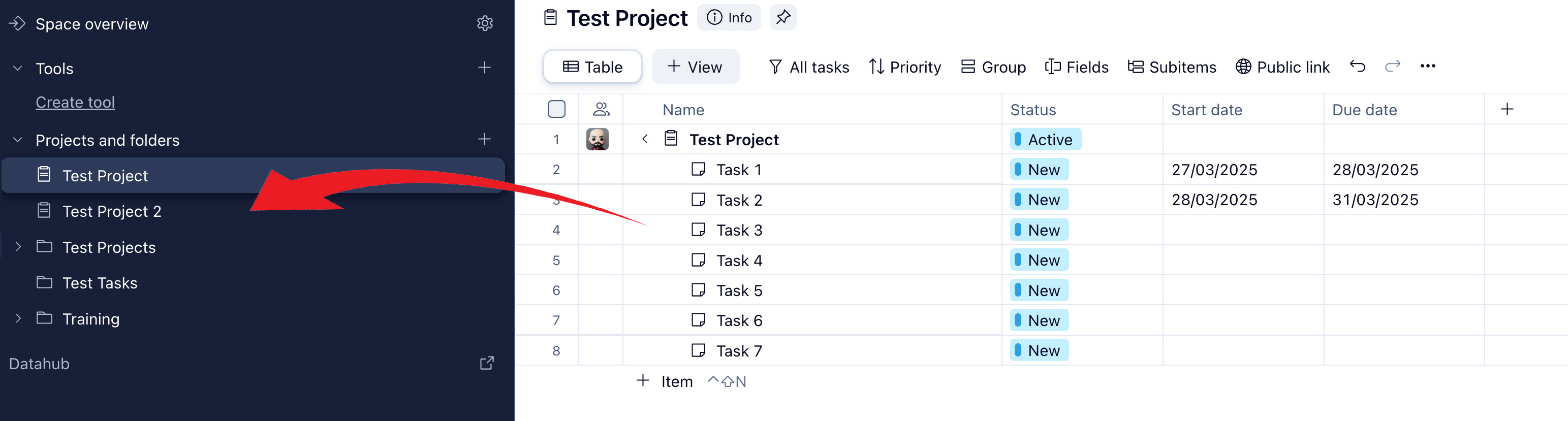
And I understand that you can enable/disable columns, they are important, but the way the information is layed out if very clunky and very hard to understand and have to take extra steps to do the same things you could in list view.
Thanks
I hadn't seen this announcement until last week (a small note in a Wrike folder saying list view was being retired - and frankly I didn't give it much thought since I don't spent use it a lot in projects and folders), but then today I refresh my To Do screen to find that the List View I've been accustomed to using for the last 5+ years to manage my work has now been completely removed and I'm stuck with the Table View. I can't express my frustration enough with this change. I understand that some views make sense for certain parts of the app, but to echo others' questions:
1. Why couldn't you rebuild the list on new technology, so the people who need this view can continue to use it?
2. The Table View is NOT a better version of the List View. They are different in their layout and how they function. To try to tell us it's the same or better is frustrating.
3. Different parts of the app require different use cases/features. While Table view may work in some spots, List view may be better in others. For myself, I am beyond frustrated to be forced to now use Table view for my To Do list.
I appreciate you working to make the app better, but I feel like this is not an improvement, and instead a really frustrating setback.
I liked how I could see all of the relevant info in a small window with the list view in my To Do list. Now it's all spread out and not easy to skim. Really feel like this update has missed the mark.
So much for bumping the sunset date to June, we were also blindsided by this change this morning.
And immediately I run into my first problem (aside from the generally slow, clunky experience). As I remove tasks from a folder that is being displayed on the left in table view, they aren't removed automatically from that view. Instead, they persist (as if they were still in that folder) until refreshing (which is obviously slow, annoying and wasn't a problem with list view).
Please revert this ASAP if you can, or at least give us List View back until June like you said you would do. This is miserable.
There are still two key features missing from mass editing in Table view - "unassign from all" (or any unassigning functionality) and follow/unfollow. These are used by my teams every day. Are there plans to add these to Table view mass editing?
Lisa Thanks for the response! I have a related question. If I disable the Start Date column, I can't figure out an intuitive way to add the start date to the task, as I'm not able to do it from the Due Date column. Previously with List View, we could set the duration of the task from start to finish, and still just see the due date. I see that there's a column option for this anymore, and it seems like now with Table View I would have to click into each individual task (View Details) to access that same functionality if we disable the Start Date column.
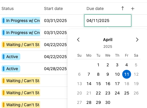
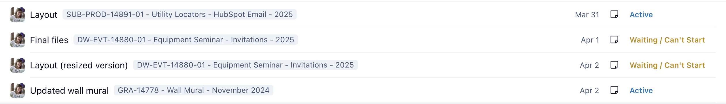
For example, here I can only select one date (4/11), so I have to keep the start date column for the task to reflect the actual duration of the task. This is important to our organization because we rely on the Workload charts and need to be able to see the start and due dates of tasks in that view.
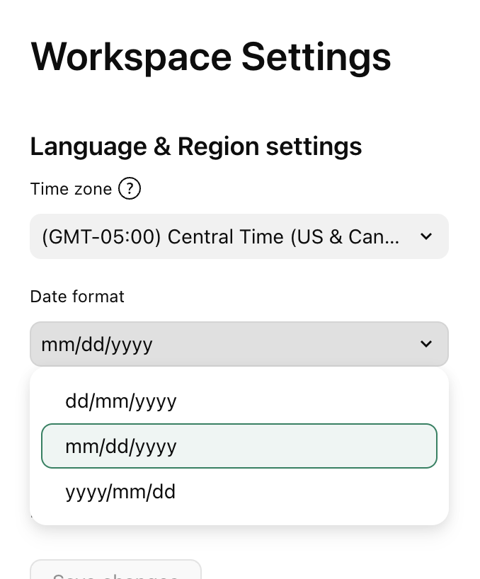
Additionally, is there a way to customize how we see the dates? We feel like the year just adds to the clunkiness of Table View, and would like to show the date as it would appear in List View, but I haven't found a setting that doesn't include the year.
Most of our team operates from their To Do list and we prefer the presentation of dates here. If you were to click into one of those dates it would open the calendar and show the actual duration of the task, which is what we're trying to replicate in Table View if possible.
Thank you!
I LOVE LIST VIEW! You had better get us some training on this new table view, have no clue how it works and will greatly upset our work flow. Please contact us for how to get trained in this as we have never used table views EVER!
kimberly.herbst@scottsdalecc.edu
I also want to add that “detach” is missing as an option from Table view, and you have to go all the way to the parent task, find the subtask, and detach from there… whereas in List View, like other features already mentioned, could be simply done from an options menu. Seriously, there are so many features missing and flaws to table view, it’s confusing that this was rolled out right now. I too was blindsided and one of the unlucky ones to have this forced on me early, rather than “gradually” thru June.
With no warning, the built-in List view disappeared, despite all the feedback here and in other threads and well in advance of the "June 2025" mention I literally just stumbled upon yesterday. Way to treat your customers!
In Sept 2024 Wrike bungled a change similar to this. The default List view was removed from hundreds of locations, with no way to tell which locations were impacted. They advised me to create a new "custom" list view, configure it carefully, then manually copy that everywhere. We literally just finished many hours of manual effort and became functional again.
NOW, I find Wrike completely modified my CUSTOM LIST VIEW everywhere, turning it into (an inferior version of) the old Table view. Everything is a mess. Most locations now have 2 identical "Table" views plus my custom list view (which is now also a table view). How stupid is this???
List view is essential for many customers, why did you not listen to customers on this thread and others?? We have the info pane open 99% of the time and now we can't see the key details. The info pane is now inexplicably closed by default. You can't drag and drop tasks. There's a ton of wasted space, the columns are not in an intuitive order, and mysteriously 'grouping' has been enabled where it wasn't before. Don't tell me I can again, painfully, change (some of) these settings manually everywhere to compensate; I just finished doing that! And remember, you don't provide a way to make global changes to any view and have it apply everywhere.
List view provided the navigation missing from the left panel; I'll never understand why the left panel can't also show the tasks under the projects and folders, but that's a different conversation...
This is unacceptable. We are actively looking elsewhere.
What a shock today when my To-Do list drastically changed from clean, legible, and simple to the most chaotic spreadsheet I could imagine.
The fact that Wrike developers are trying to convince us that these changes are meant to enhance our user experience is frankly laughable. A simple comparison of the old view to the new shows how extremely chaotic and hard to read the Table View is. For starters, the dates all run together and are extremely hard to view at a glance. I’d rather spend my time working rather than trying to decipher what tasks and jobs I have due on each day.
The entire job title itself is missing from this view, and even when you force add it by turning on the “location” toggle, it’s still not nearly as legible or user friendly as it was in the past. It's overcomplicated, clunky and poorly designed.
I have been frustrated w/ Wrike updates in the past, but this is beyond terrible. Please revert this change and figure out a way to keep List View for your community of user who rely on it to work effectively every single day.
Lisa Our List View has now been removed, despite you advising that the sunset was being postponed till June. Can you please advise why this has been done?
Karen Bullock I never use list view, but here is the unassign (and assigning function) in table. Maybe this will help?
Follow/unfollow is available but you have to go into each task or subtask and select to follow or unfollow.
Courtney Roberts Have you tried using Dashboards? There is a widget called To Do that you can set up to filter and display tasks pretty closely to your original to do list and it is displayed using their table view? You can filter to show tasks broken down by due date range (so you know at a glance importance) or not at all? There are a lot of different ways to display/ filter/sort? You don't have to show In Progress, Completed or Starred tasks widgets on this either (we just choose to so our resources know the status of each task).
Danielle Wilson Wow, maybe the "unassign from all" was just added! It was not there the other day for me but is appearing now, thanks for the heads up.