New custom field layout truncates field labels

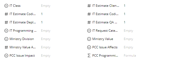
I appreciate the idea of formatting the custom fields to have more of a columnized layout. Unfortunately, in our case at least, the layout truncates almost all of the field names, which hurts the readability even more than their previously disorganized layout did.
I also find it odd that the new form was applied to tasks and not projects.
Unless you can find a way to organize the fields that doesn't hide most of the field name, I would request that we have the option to use the old format, since being able to see the field names at all is a bigger factor than placement.
Thank you