Request: Full Breadcrumbs Desperately Needed in Detail View

Hi Wrike team, sharing some navigation feedback based on my experience so far (screenshot attached). I’m giving Wrike a full, fair shot since our company provides licenses, but this has been the one thing that consistently pushes me away from using it more.
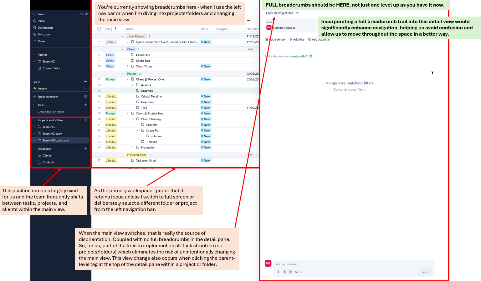
1) Full breadcrumbs are needed in the task detail view
Right now the detail pane only shows a single parent level (breadcrumb for tasks or a tag for folders/projects). With deeper folder structures, it’s hard to understand where I actually am without jumping back to the main list view.
Suggestion:
Add a full breadcrumb trail at the top of the detail view so I can easily see the full path and move up the hierarchy. It would make the detail view feel self-contained and stop the constant back-and-forth.
2) Main view switching creates disorientation
When I click the parent tag in a task detail, Wrike updates the entire main workspace. I know this is how it’s designed, but it replaces the view I was working in, which throws off the flow.
I’m not necessarily suggesting for that behavior to change. I just want to point out that the combo of:
• no full breadcrumbs in the detail view, and
• the main view switching automatically
…is what causes the confusion.
If the detail view had full breadcrumbs, I wouldn’t need to keep jumping back to figure out where I am.
When moving quickly between clients, projects, and nested tasks, it’s easy to lose context. This is honestly the main reason I’ve struggled to fully adopt Wrike, even though I’m trying to make it work.
TL;DR - Adding full breadcrumbs to the task detail view would go a long way toward making navigation feel more intuitive and less confusing.
Rohan V Community Team at Wrike Wrike Product Manager Become a Wrike expert with Wrike Discover
Rohan V Wrike Team member Become a Wrike expert with Wrike Discover