[From Wrike] An Update on the Recent Item View Changes

Hello Wrike Community,
My name is Slava, I am a Product Manager at Wrike responsible for the Item view.
I wanted to address the concerns raised by you, our valued customers, regarding the recent update to our Item View. I understand that this change has caused some inconvenience. Our goal has always been to provide an efficient and seamless experience, and it's clear that we've fallen short of that in this instance.
We've been closely monitoring your feedback and we recognize that the changes have not been as intuitive or helpful as we intended. We want to reassure you that we take these concerns seriously and are committed to making things right.
We're currently in the process of implementing several steps to improve the Item View and make it more convenient for you. Here’s what we are currently planning:
- We will introduce a switcher between the rolling-down section and the side panel with custom fields. All users will be able to switch according to their preference. Moreover, in the side panel you will also find the search feature that we introduced recently
- Fields will be shown in multiple columns (after a certain amount of fields and in accordance with the Item view's width) in the current layout (rolling down section)
- We will also save your "More/Less" setting - it will be expanded or collapsed when you open the Item view again
- We will continue improving the Item view to provide you with the best experience
These are the example mockups of the upcoming updates:


We are currently working towards releasing the above improvements in the next few weeks, and we’ll keep you posted when they are available. Please note that these updates are for the Item view only for now - this means that they will not be reflected in the Custom Item type editor (configurator) layout for now.
Our team is working tirelessly to ensure that the updated Item View will not only meet but exceed your expectations. We truly value your patience and understanding during this time.
We're grateful for your continued support and feedback. It's this open line of communication that enables us to improve, and we encourage you to keep sharing your thoughts and experiences with us.
Thank you for being a part of the Wrike Community and sharing your feedback. We're committed to making Wrike the best it can be for you.
----
Links where this topic has been discussed:
@..., we have the same issue and would love to be able to have expanding sections for groups of our Custom Fields. Thanks Michael Kelley for raising this.
Thanks a lot for the additional feedback here folks! 🙌
Lisa Community Team at Wrike Wrike Product Manager Become a Wrike expert with Wrike Discover
Lisa Wrike Team member Become a Wrike expert with Wrike Discover
Thanks @... for the update. I really like the new Design and Lightspeed over all, especially Custom Item Types. They make managing different types of task and information a lot easier, and our teams are really starting to rely on them. I really like the new multi column layout! It would be nice in the future to beable to choose the column layout, and maybe even have a third full width column for large text fields.
I do have one request that will make our experience much better. Could it be possible to not show the "more fields" dropdown? Since we use Custom Item Types for many different things, usually the field under the more field drop down are not related to task being viewed, and it is causing some confusion. For instance we have a folder that is FAQs, and have some specific fields related to those. So when those fields show up on a non FAQ task, I am always telling people, to just ignore them. It would be best if they just didn't show up at all.
Regarding the changes above, it would be nice as an admin to have the option to lock view to either roll-down or side bar. The same goes for the more/less option. The reason being so all users are seeing the information the same way. I can see person preference option being popular, but this can be cumbersome when talking to multiple people and asking them to look at the info in a certain field and each person has that field in a different location, and some can't find it because it is under the closed roll-down. I could see this being an option on the Custom Item Type edit page, so the person creating the Item Type chooses how the info is displayed.
Thanks for all your hard work on these features, and can't wait to see what you come out with in the future!
Thanks a lot for your detailed feedback Russell Sprague, Slava and the team are keeping a close eye here!
Lisa Community Team at Wrike Wrike Product Manager Become a Wrike expert with Wrike Discover
Lisa Wrike Team member Become a Wrike expert with Wrike Discover
Our team is struggling without having access to the info panel. We rely heavily on the info panel for every task along the way to project completion. Not having access to this from an individual task is impacting all levels of our organization, power users to collaborators. The simple fix to this is to add the new INFO button next to each task. Referencing project technicals is key for us. Please bring it back to the forefront!
We use custom fields that at time contain paragraphs of information. Single row text fields add difficult to be able to read the field contents without 1) hovering over the field or 2) editing the field. In addition, some users also do not have editing capabilities and the hover option does not allow view of the entire field. The previous change increased the the length of the text field, making this a little easier. The new update changes this to multiple columns, reducing the field length again.
Would it be possible to add more layout features to the custom item types so we may choose whether to have one or two columns? Even better, the ability to expand field height to multiple rows to accommodate what are essentially text boxes and not fields?
Thanks a lot for your continued feedback here, folks! I'll pass it on to Slava now, and we'll keep you posted on all the future updates 🙂
Lisa Community Team at Wrike Wrike Product Manager Become a Wrike expert with Wrike Discover
Lisa Wrike Team member Become a Wrike expert with Wrike Discover
Hi all! We've compiled a list of issues. I'll send this as a support ticket but since so many people are having similar issues, it might be helpful here:
I agree with all the points https://help.wrike.com/hc/en-us/community/posts/16478588783895/comments/16668688899991 . We have shifted from Asana to Wrike and my last 6 months experience with Wrike is good or bad both. Database is good in Wrike, but for simple things we have to spend a lot of time, and rather my and my team's efficiency has got reduced. I request Wrike Team to pay attention to what has been written by Meredith Lupa .
And please introduce custom field sidebar at the earliest. It is quite irritating to scroll up and down for a simple thing and waste time.
@... When a task is added to a location ->Project, the fields related to that project do not appear, it needs to refresh the browser and then the task will appear. Desktop app behaves in similar way. Refreshing the task just to get the particular fields is very irritating. Please fix this. It was behaving right before the sidebar was removed.
@... Thank you for making fields view in 2 columns here. I have a suggestion here, Generally every task is multi located in 4-6 projects. In the columnar view, every time one has to click to check where the task is located, even to add or remove from a particular location, one has to click the field and the add or remove the project as required. Can this field be in one complete line instead of columnar view?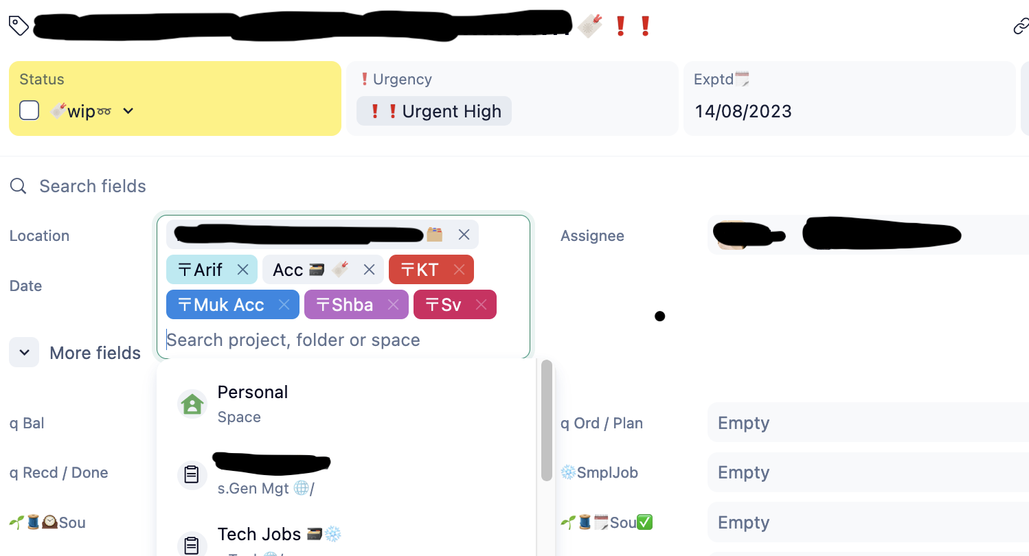
@... thanks a lot of the update. having two custom fields is a much more efficient utilization of space. in addition to what sv - has asked for [wider single column view for locations], could we have the main CF's [as defined in Custom Items] open up along with the task details - without needing an additional click...?
Hopping on to sv -'s reference of Asana: A team I worked with in the past has moved from Wrike to Asana, because Wrike was too complex and required too many clicks. (This was pre Lightspeed!)
While it is easier for us heavy users to apply filters to everything and have big tables with all info available, regular users do prefer a sleek and easy overview. After transition the feedback I received is very similar to the concerns people now have re the new list view, because Asana's table view was perceived as too cluttered and too much information, compared to Wrike's List View. Wrike will loose this advantage, when merging List View with the new Table View.
Big thanks for the detailed additional feedback here, folks! As always, I'm sending it on to the team now 👍
Lisa Community Team at Wrike Wrike Product Manager Become a Wrike expert with Wrike Discover
Lisa Wrike Team member Become a Wrike expert with Wrike Discover
Lisa do you happen to know when the switcher toggle will be rolled out?
Would also like to know when the toggle/switcher to have the custom field side panel. Not having this is greatly hindering my ability to get my architecture and team up to speed with the Lightspeed changes.
Hi folks! We're happy to let you know that we've just released a couple of updates for the Item view that include a mode switcher 🤩 Big thanks for all your feedback here! Please read more in this post and let us know your thoughts 🙂
Lisa Community Team at Wrike Wrike Product Manager Become a Wrike expert with Wrike Discover
Lisa Wrike Team member Become a Wrike expert with Wrike Discover
I love the new sideview - but I miss the additional information prior shown in the top line. Not only the location, but also the follow icon. This is very important in my opinion, but I ask not just to bring it back again, but improve it in this process.
As I suggested years ago, I'd like to see without additional clicks who's following a task - in order to know who'll get notified if I send a message @followers. Se my suggestions here: https://help.wrike.com/hc/en-us/community/posts/360044107893/comments/360011460193
I just regocnized that it's also hard to identify the parent tasks in this new view. In my example I have a subtask assigned to two different parent tasks - but it seems to be one, as there's only a blank space as a separator between both tasks. A (light grey) background of each parent task could help a lot!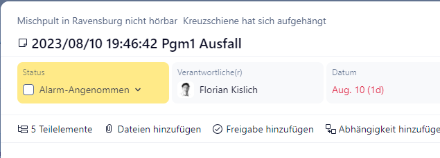
Another detail: Why isn't the with of the column expanded to show the full name of all custom fields, if there's enough space?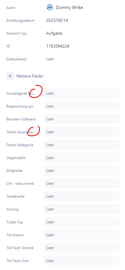
Thanks a lot for your additional feedback Florian Kislich, I'm sending your suggestions to the team now 🙂
Lisa Community Team at Wrike Wrike Product Manager Become a Wrike expert with Wrike Discover
Lisa Wrike Team member Become a Wrike expert with Wrike Discover
Is there an option to place custom fields into separate sections?
Currently we have all custom fields listed in one section (under the "More fields" dropdown) but hoping we can customize and separate sections for each custom field based on categories.
Hi Lance Abendan, thank you for your question. When creating a custom item type, you can define which custom fields should be part of it:
The custom fields you don't include in the default selection will appear under the "More" section.
Is this what you were looking for?
Thanks @.... I should mention that:
Also, the 6 custom fields under the More Fields section of my previous Lance's Test Project screenshot were added through the old design under Manage Custom Fields (screenshot below) and I've removed those fields for now (through the old design) for the sake of this inquiry.
Is there a way we could have Projects with multiple sections of fields based on category (mockup example below with 3 categories/sections):
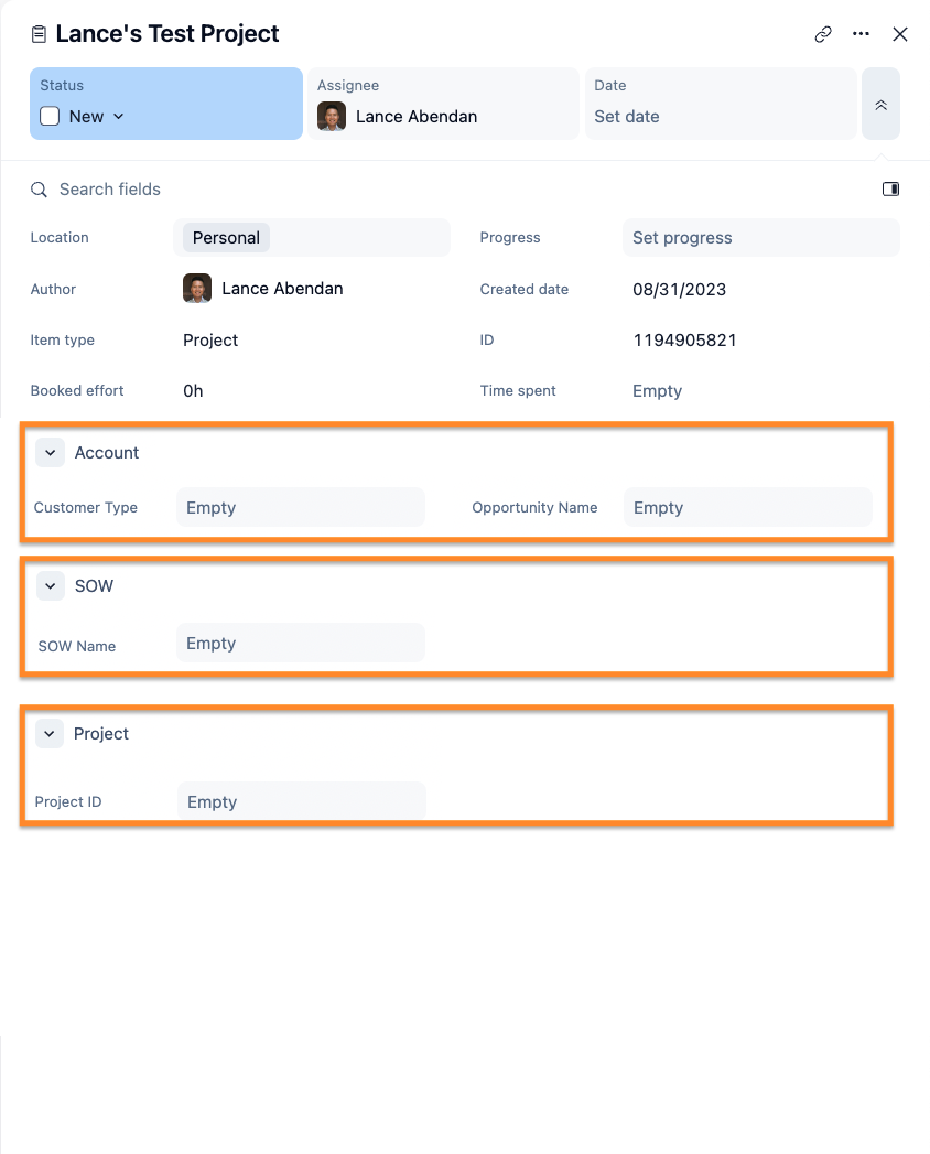
Also, is there a way to add custom fields into Projects through the Lightspeed design?
Hi Lance Abendan, thank you for your reply.
In this case, the solution would be to switch from regular projects/tasks to custom item types projects/tasks. However, it is not possible to create multiple categories in the custom field section, I have passed your feedback on to our Product Team.
Regarding the option to add/remove custom fields to a relevant location, you can easily achieve this with Lightspeed enabled, here are the steps you need to follow.
Is there anything else I could do to help you?
Today the Location field is missing from our Wrike instance. What changed!? How do we easily tag things now? Please advise.
UPDATE: I found it, you moved it back to the top under the TItle. That works.
Why do you keep moving things around?
We have the same issue as Cal Anderson. Thanks in advance for addressing quickly.
It has returned to it's original place! Thanks wrike team for bringing it back! That's just awesome!
Great. Wrike starts to hear what the customer say. First step in a way of continues improvement hopefully. That is much better now.
Cal Anderson I agree in part with the question "why do you keep moving things around". We are trying to prepare for our LightSpeed go live this coming Tuesday, updating internal documentation and training users on the changes. The Wrike development continues to ignore requests for a brief period of code freeze so customers can finish these tasks. It is frustrating to our document writers and end users. Perhaps next time, roll out the full re-design to all customers at the same time and a code freeze could be considered.