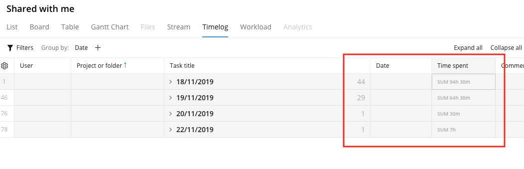
Timelog View UI should be improved - Not enought contrast

The way Timelog table summarizes the TimeSpent, for example, is not good enough. There's no contrast between Numbers and background and it's difficult the readability
The previous UI was better than that.
Can you help? Answer the question and work your way towards becoming a Wrike Ninja 🥋 Sign in and answer.
Iniciar sesión para dejar un comentario.