UI - Side Nav

What would make the left side nav much more better is if "Bookmarks" and its icon and also "> Folder" were indented for each Space. Right now, it does not visually look like Bookmarks is a part of its parent space - it looks instead like they share the same hierarchical level.
As a user, right now it always confuses me what is within the Space and what is a new bucket and I have to think for a second. It would really help the visual organization to more have more clearly (visually) defined buckets in this nav.
(same applies to Shared with me and Blueprints)
Current: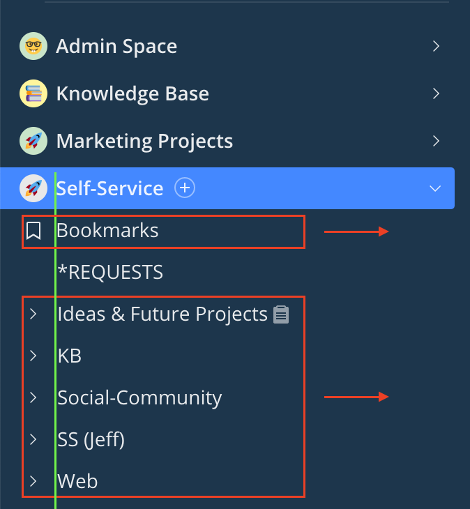
Suggested:
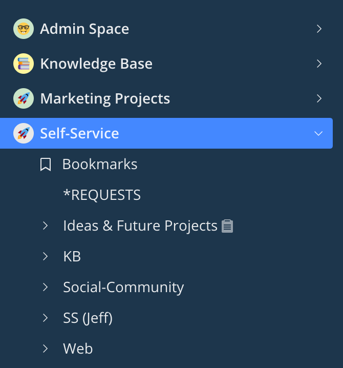
Side by side:
Thanks for your feedback, @Rachel, really valuable! I'll make sure to pass it on to the team 🙌
Lisa Community Team at Wrike Wrike Product Manager Conviértete en un experto en Wrike con Wrike Discover
Lisa Wrike Team member Conviértete en un experto en Wrike con Wrike Discover