Redesigned subitems in Item view Feedback
Hello!
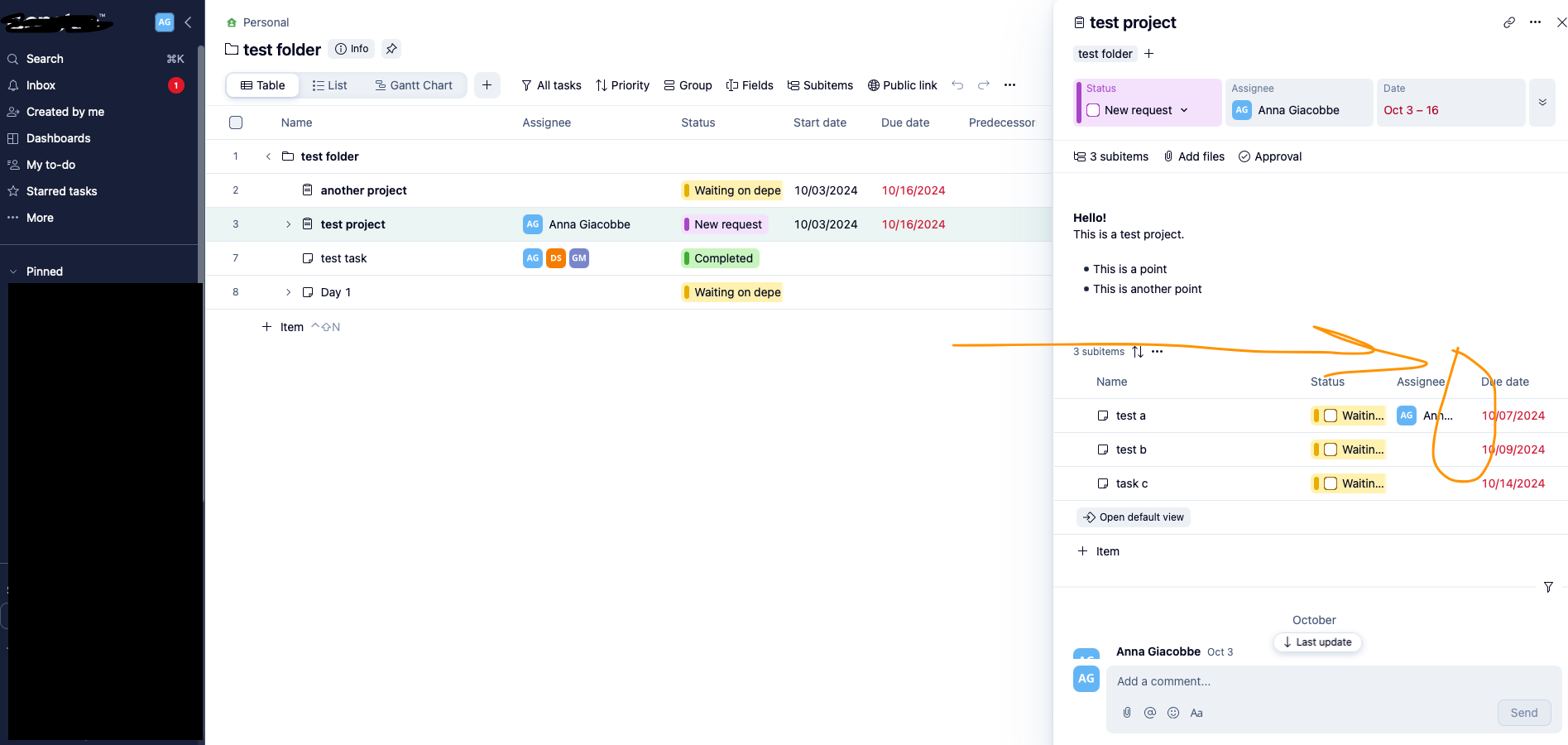
I wanted to share some feedback on the Wrike Labs experiment Redesigned subitems in Item view Feedback. I'm not sure if anyone else has tested it, but I'm curious to hear what y'all think of it, too!
Pros:
- Easier to edit subitems without having to open each one individually
Cons:
- There's no way to customize what shows up here
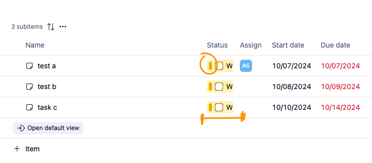
- Depending on screen size and if the side-menu is open, not all columns display (Start Date gets cut off)

- Status seems a bit “chunky” with the UI design of the label (bold bar on the side of the checkbox) and gets cut off (defeats the purpose of displaying it if we can’t see what the status actually is)

- Field columns get cut off too; see “Assign-” in the previous screenshot
- Can't wrap text - issue for items with long names
Thoughts from my team:
- "I find I need to zoom out to see things better"
- "It's overstimulating"
- "I don't need to see the start date and assignees in a column like that"
Overall, I think the idea of having a more editable UI for subitems is great, but perhaps it would be more user-friendly if it looked sleeker/simpler/less-cluttered (similar to the old design that mimicked List view) and allowed us to show the fields we think are important to show at this level.
Have you tried this redesign? I'd love to hear your thoughts and experiences with it!

Hi Anna,
did you read the comments section of the related article? Subitems Lists within Item View in Wrike Labs 🧪 – Wrike Help Center
I am very happy that Wrike is working on the subitems view. I also agree with you that there's still optimization needed. I'd like a table view like feature to edit the visible colums. And I hope that they will also enable mass-editing in this view to achive the faster editing of subtasks, as I reeuested here: select multible subtasks in item view for mass-editing – Wrike Help Center
Florian
Hi Florian Kislich!
Re: the comment section: I did have a look! It was general feedback without any specific callouts. Wrike Support said it was okay for me to submit a post with my feedback, so here we are 😛 I wanted to include screenshots of specific things such as the cut off columns to really illustrate my feedback. I do love the fact that we can edit our subitems more easily this way though without having to jump into each item, though! I think it's a great firsts step in the right direction!
Mass-editing would be amazing, especially on those items that have many many subitems!!
Hi Anna, look what I just found out: You can already adjust the width of the columns! :D
Our System Admin team has been testing this feature and everyone loves it! Big win to help new users who are @mentioned on a Project Info Pane to help show them more details on the tasks within it.
We liked the old wording on the button that used to say “Go to full details” (because not everyone knows what a Default View” is) and would love to be able to see the Effort column on the subitems but overall it’s great!
Hi everyone 👋
Thanks a lot for all the feedback you've shared here so far, and of course I've shared it with the team that launched this update for subitems 🙂
Lisa Community Team at Wrike Wrike Product Manager Conviértete en un experto en Wrike con Wrike Discover
Lisa Wrike Team member Conviértete en un experto en Wrike con Wrike Discover
Our team. is still learning the system and Table view and this is way too much to see, they are now calling us to ask what they should do It would be great if we could turn it off for now but I cannot find how to do it globally!!!
Very much overkill for us!!!