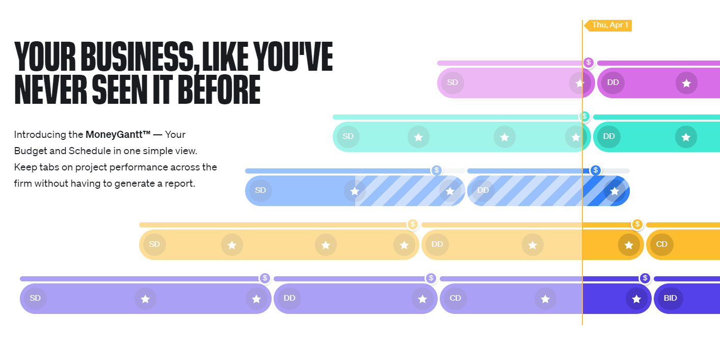
Budget Versus Actual Graphic

It would be great to see a graphic at the top of each Gantt chart view that illustrates how much budget we've spent versus the timeline of the project itself. This lets us know if we've overspent for where we are etc.
Parece que no tenemos la página traducida que buscas, pero tenemos otro contenido en inglés y ofrecemos soporte en inglés.
¿En qué podemos ayudarte hoy?
Aprender. Compartir. Discutir.
It would be great to see a graphic at the top of each Gantt chart view that illustrates how much budget we've spent versus the timeline of the project itself. This lets us know if we've overspent for where we are etc.
Folllowing List for Post: Budget Versus Actual Graphic
[this list is visible for admins and agents only]
That's a very interesting idea, Andre Herrero! Thank you for sharing, I'm passing it to the team as usual 👍
Lisa Community Team at Wrike Wrike Product Manager Conviértete en un experto en Wrike con Wrike Discover
Lisa Wrike Team member Conviértete en un experto en Wrike con Wrike Discover