UI tweak in Blueprint Smart Folder (overview)

Hiya!
Super small recommendation here, but the lack of it makes for an inconsistent experience across the platform.
We are now fully transitioned over to Table View (from List View), and as a result, so have our Smart Folders like the Recycle bin and Blueprints.
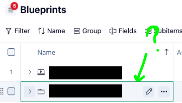
Within the account-level. Blueprint Smart folder (the main overview), projects and folders here do not have the Open icon as they do when you drill into even one level down.
It feels a bit awkward because naturally with so many main parent folders at this level, we want to be able to open into each with one click as we are so used to doing across folders and projects across the platform!
Here is what I mean:
At the main overview at the account level, hovering over a folder or project only has icons for Rename and More:
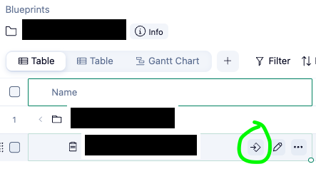
When you finally get into one folder, let's say, you'll notice the addition of the Open button, which let's you open the item in its own view, without clutter:
Simply asking for the Open button to be added at the main Blueprint overview on folders and projects for consistency and ease of navigation :)
Hello, Anna Giacobbe! 🙋♂️ Thanks for highlighting and posting this suggestion! We’ve shared your post with the product team and will keep you in the loop if there are any changes 🙌
Rohan V Community Team at Wrike Wrike Product Manager Werden Sie ein Wrike-Experte mit Wrike Discover
Rohan V Wrike Team member Werden Sie ein Wrike-Experte mit Wrike Discover