Better UI/UX for Location button (Table view)

Hiya!
I'd like to share some product feedback for the UI/UX on mass-editing locations in Table View.
I find that I am always fighting to select items and confirm that I am shipping them off to the right folder/project (location).
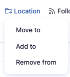
1. Location button itself
- I do like that the 3 options are consolidated in one, as seen below. No issues here!
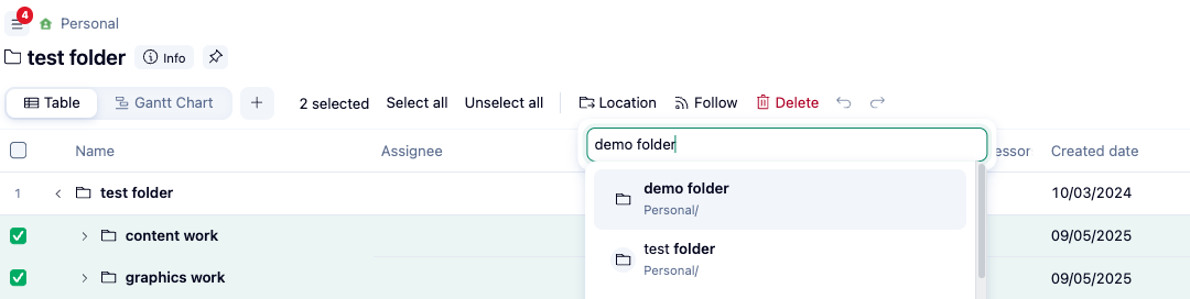
2. Searching and selecting new location(s)
- I'm not sure if it's just me/my laptop, but I often have to click a couple of times to actually select the new location. The frustration begins here.
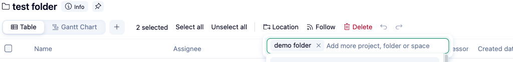
3. Confirming/applying changes of new location(s)
- This is where it is the most frustrating. There's nothing to really "send off" or confirm the desired changes to the location.
- Sometimes I need to click outside of the box, sometimes I click enter. Sometimes when I do either of these things, it doesn't work. Or sometimes when I click out when I mean to cancel what I'm doing, it ships it off.
I don't have the answer to what would be the perfect UI/UX of this, but all I know is that I try to use this feature when dealing with a large amount of lines, and it's usually quite the frustrating experience, so I end up going in one by one to add/remove locations. Perhaps have a popup when either Move to/Add to/Remove from is clicked with a submit button? Or remove the dropdown from Location and have a popup that has the options for Move to/Add to/Remove from, as well as the searchable box and a Submit button? Or keep it as is and add a small ➡️ button of sorts within the box? Just some thoughts!
This makes perfect sense, Anna Giacobbe. Adding a confirmation button for the Move to/Add to/Remove mass actions is a great suggestion. I have forwarded this to our team. Thank you very much! 😊👍🏽
Basudha Sakshyarika Community Team at Wrike Wrike Product Manager Werden Sie ein Wrike-Experte mit Wrike Discover
Basudha Sakshyarika Wrike Team member Werden Sie ein Wrike-Experte mit Wrike Discover