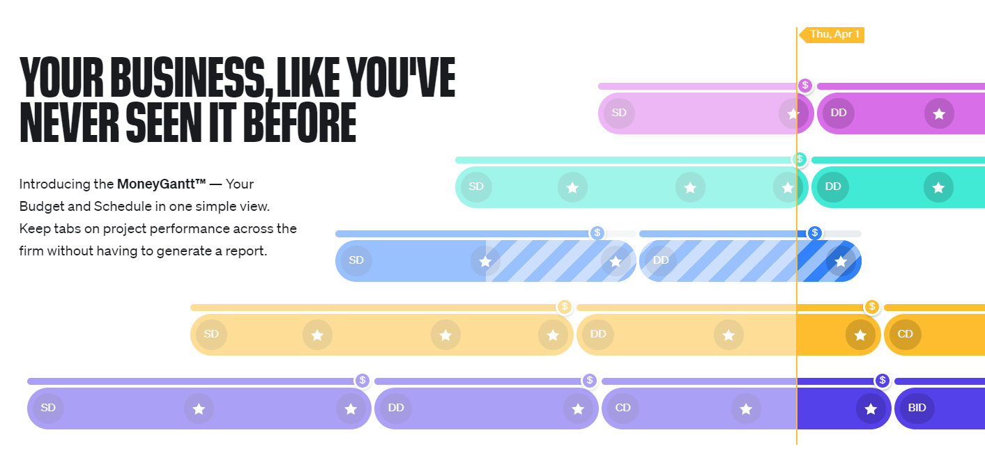
Budget Versus Actual Graphic

It would be great to see a graphic at the top of each Gantt chart view that illustrates how much budget we've spent versus the timeline of the project itself. This lets us know if we've overspent for where we are etc.
Il semble que nous n'ayons pas la page traduite que vous cherchez, mais nous avons d'autres contenus en anglais et offrons une assistance en anglais.
Que pouvons-nous faire pour vous ?
Apprendre. Partager. Discuter.
It would be great to see a graphic at the top of each Gantt chart view that illustrates how much budget we've spent versus the timeline of the project itself. This lets us know if we've overspent for where we are etc.
Folllowing List for Post: Budget Versus Actual Graphic
[this list is visible for admins and agents only]
That's a very interesting idea, Andre Herrero! Thank you for sharing, I'm passing it to the team as usual 👍
Lisa Community Team at Wrike Wrike Product Manager Devenez un expert de Wrike avec Wrike Discover
Lisa Wrike Team member Devenez un expert de Wrike avec Wrike Discover